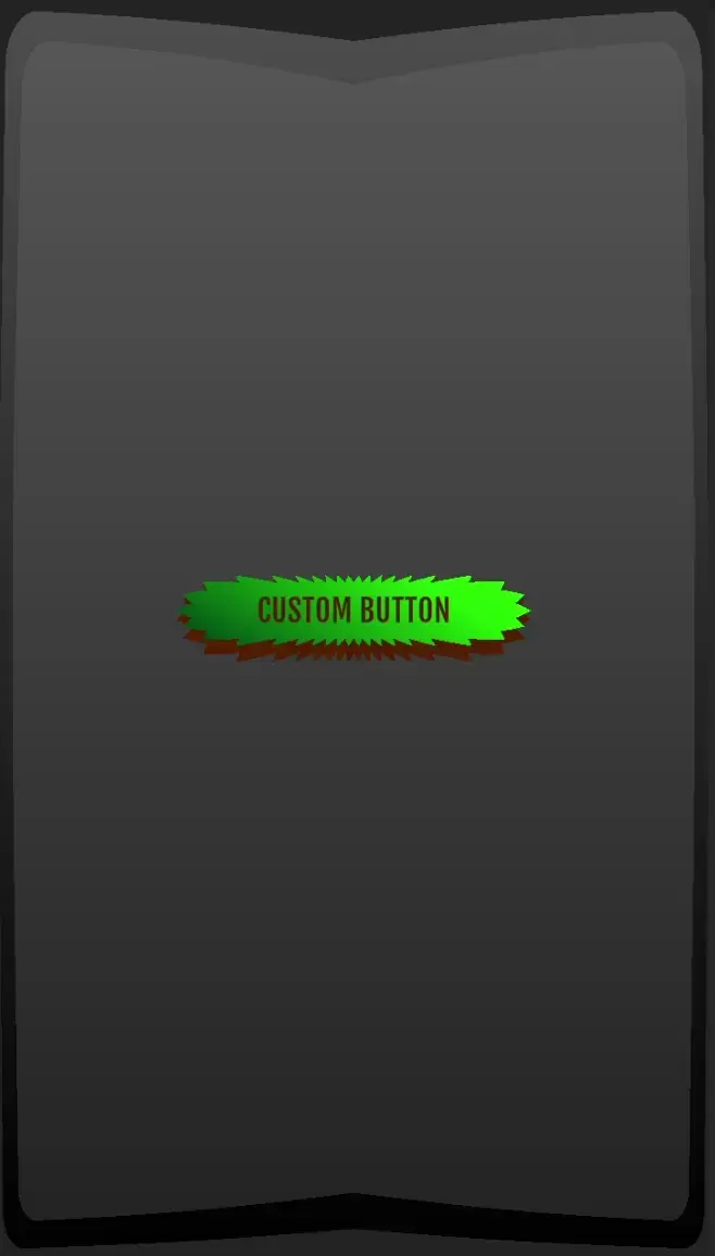
Custom Button - Documentation
Introduction
The Custom Button prefab is a flexible and highly customizable UI component designed for Unity developers. It allows you to create buttons with tailored shapes, colors, animations, and interactivity without the need for coding. This documentation covers all the settings and options available, helping you set up and customize the button to fit your project's needs. Throughout the documentation, the Custom Button prefab is also referred to as the Button prefab.
Example Usage
The following steps explain a simple way to set up the Button in a project.
- Copy the Button prefab into a scene.
- Modify the new Button instance settings, changing the button shape, color, sound, animation settings, etc.
- Create a Button prefab variant from the modified Button instance so that it can be used throughout the project.
A video walkthrough can be found here: Video Walkthrough
The Custom Button trailer can be found here: Custom Button Trailer
File and Folder Structure
The following are folders or files in the Custom Button package:
Animations
Stores animations associated with the Button prefab and the demo scenes.
Fonts
Stores fonts associated with the Button prefab. Place fonts here and modify the Button prefab in the Prefabs folder to include the added font file.
To add a font:
- Click on the Button prefab.
- Open the Setup section in the Custom Button component.
- Open the Available Fonts subsection.
- Click on "Add Font".
- Drag the TMP_Font Asset file onto the newly created list item.
When the font has been added to the Button prefab, the newly added font can be selected in the Custom Button component under Text -> Font.
Materials
Stores materials associated with the Button prefab and demo scenes.
Prefabs
Stores the Button prefab. The Prefabs folder is the recommended place to store variants of the Button prefab.
Scenes
Stores the demo scenes which demonstrate the capabilities of the Button prefab. The "Example" scene shows different variations of all settings and acts as a good starting point for any project. All other scenes demonstrate specific button settings. For example, the "Shape" scene demonstrates different shapes that can be created with the Button prefab. For optimal viewing, it is recommended to set the display resolution to 1920x1080 when interacting with the demo scenes.
Scripts
Stores scripts associated with the Button prefab, including a custom editor script.
Shaders
Stores the Button prefab shader.
Sounds
Stores sounds associated with the Button prefab. Place sounds here and modify the Button prefab in the Prefabs folder to include the added sound file.
To add a sound:
- Click on the Button prefab.
- Open the Setup section in the Custom Button component.
- Open the Available Sounds subsection.
- Click on "Add Audio Clip".
- Drag the Audio Clip file onto the newly created list item.
When the sound has been added to the Button prefab, the newly added sound can be selected in the Custom Button component under Sounds -> Click Sound.
Readme
This file. Holds information about the Button prefab, best practices, and an explanation of all settings.
Settings
The settings for the Button prefab are divided into several categories, allowing you to modify everything from its shape to its behavior when interacted with. Below is a breakdown of the available settings:
Shape Settings
Button Face Offset
- Type: Float
- Description: Offset of the front face of the button relative to the underlying button layer. The offset ranges from 0% to 100% of the button's total height. A higher percentage creates a more prominent depth effect, making the button face appear raised or recessed.
Aspect Ratio
- Type: Dropdown (Square, Rectangle, Custom)
- Description: The aspect ratio of the button.
- Square: Maintains a 1:1 ratio between width and height.
- Rectangle: Automatically adjusts the width-to-height ratio based on the RectTransform.
- Custom: Enables manual control over the width and height of the button.
Width (Custom only)
- Type: Float
- Description: Manual override of the width of the button when Custom is selected in the aspect ratio dropdown.
Height (Custom only)
- Type: Float
- Description: Manual override of the height of the button when Custom is selected in the aspect ratio dropdown.
Corner Settings
Each corner of the button can be customized with a unique shape, offering flexibility in the visual design of the button. The Top Left, Top Right, Bottom Left, and Bottom Right corners can be modified separately.
Shape
- Type: Dropdown (Cloud, Cut, Round, Spike, Splash, Straight)
- Description: The shape of the corner. Each shape offers a distinct visual style.
Intensity
- Type: Float (0-100)
- Description: The intensity of the selected corner shape. This value determines how pronounced the shape is. For example, if Round is selected, the Intensity acts as the corner radius, where a higher value results in more curvature.
Effect Settings
Corner shapes Cloud, Spike, and Splash have additional parameters that affect their shape.
Amplitude
- Type: Float (0-100)
- Description: The distance the shape expands to the center of the button.
Density
- Type: Float
- Description: Adjusts how frequently the shape occurs around the corner.
Outline Settings
Color 1
- Type: Color Picker
- Description: The first color in the button’s outline color gradient.
Color 2
- Type: Color Picker
- Description: The second color in the button’s outline color gradient.
Gradient Angle
- Type: Float (0-100)
- Description: The outline color gradient angle.
Thickness
- Type: Float (0-100)
- Description: The thickness of the outline in proportion to the button’s size.
Color Settings
Color 1
- Type: Color Picker
- Description: The first gradient color for the front layer of the button.
Color 2
- Type: Color Picker
- Description: The second gradient color for the front layer of the button.
Gradient Angle
- Type: Float (0-100)
- Description: The front layer color gradient angle.
Background Color
- Type: Color Picker
- Description: The background layer color.
Text Settings
Font
- Type: Dropdown
- Description: The font of the text in the button.
Text
- Type: String
- Description: The text displayed in the button.
Text Color
- Type: Color Picker
- Description: The color of the text in the button.
Font Auto size
- Type: Boolean
- Description: Auto size the font to fit inside the button.
Animation Settings
There are 5 button states: Normal, Highlighted, Pressed, Selected, and Disabled.
When a user hovers over a button, the button goes into a Highlighted state. When the user clicks on or touches a button, the button goes into a Pressed state. When the button has been pressed and released, the button goes into a Selected state.
There are different types of animations including Idle, Focus, Unfocus, and Click animations. Idle animations are performed when a button is in the Normal state. Focus animations are performed when a button is in either the Highlighted or Pressed state. The Unfocus animations are performed when a button has left the Pressed state entering the Pressed state again or the Selected state. The Click animation is performed when a button is Highlighted, Pressed or Selected.
Click (click)
Enable Animation
- Type: Boolean
- Description: Enable the click animation.
Speed (ms)
- Type: Float
- Description: Duration of the click animation.
Wiggle (idle)
Intensity (%)
- Type: Float
- Description: Intensity of wiggle animations.
Speed (ms)
- Type: Float
- Description: Duration of wiggle animations.
Delay (ms)
- Type: Float
- Description: Duration between wiggle animations.
Float (idle)
Intensity (%)
- Type: Float
- Description: Intensity of float animation.
Speed (ms)
- Type: Float
- Description: Duration of float animation.
Shrink (focus)
Intensity (%)
- Type: Float
- Description: Intensity of shrink animation.
Speed (ms)
- Type: Float
- Description: Duration of shrink animation.
Rebound (unfocus)
Intensity (%)
- Type: Float
- Description: Intensity of rebound animation.
Speed (ms)
- Type: Float
- Description: Duration of rebound animation.
Sound Settings
Click Sound
- Type: Dropdown
- Description: Sound played on button press.
Preview Sound
- Type: Button
- Description: Play the selected click sound.
Mobile Settings
Vibrate
- Type: Boolean
- Description: Vibrate on button press.
Setup Settings
Animator
- Type: Animator
- Description: The Animator that controls the button's animations.
Text UI
- Type: Text Mesh Pro UGUI
- Description: Text object child of the front facing layer of the button.
Top Image
- Type: Raw Image
- Description: Raw Image component of the front facing layer of the button.
Bottom Image
- Type: Raw Image
- Description: Raw Image component of the background layer of the button.
Top Rect
- Type: Raw Transform
- Description: Raw Transform component of the front facing layer of the button.
Bottom Rect
- Type: Raw Transform
- Description: Raw Transform component of the background layer of the button.
Sound
- Type: Audio Source
- Description: Audio Source component attached to the button GameObject.
Available Sounds
- Type: List [Audio Clip]
- Description: List of Audio Clips that can be selected in Sound Settings -> Click Sound.
Available Fonts
- Type: List [TMP_Font Asset]
- Description: List of Fonts that can be selected in Text Settings -> Font.
Force Update
- Type: Boolean
- Description: Button will redraw every frame.
Refresh Button
- Type: Button
- Description: Force replaces the shaders associated with the front and background layers. Force refreshes the font settings.
Changelog
Version 1.0
- Initial release of the Custom Button prefab.
Licensing Information
Custom Button
This package is distributed under the terms of the Unity Asset Store End User License Agreement (EULA). By purchasing and using this package, you agree to abide by the terms set forth in the EULA, which governs the usage, modification, and distribution of this package and its contents. For full details, please refer to the official Unity Asset Store EULA: https://unity.com/legal/as_terms.
This package includes fonts and sounds that are subject to open-source licenses.
Font Files
The fonts included in this package are sourced from Google Fonts and are licensed under the Open Font License (OFL). This means they are free to use for both personal and commercial projects. You are allowed to embed, modify, and redistribute these fonts as long as you comply with the terms of the OFL.
Audio Files
The sound effects and audio files included in this package are licensed under the CC0 (Creative Commons Zero) license. This means they are free to use, modify, and redistribute without any attribution required, and can be used in both personal and commercial projects with no restrictions.
For any inquiries or support requests, please reach out to us at [email protected].


